
eLearning
27 October 2025
Mobile-First Learning: a Guide for Modern L&D Teams
What Is Mobile-First Learning?
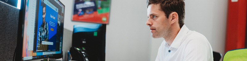
Mobile-first learning prioritises mobile devices from the very start of the design process. Rather than adapting desktop courses to smaller screens later, content is built for mobile use from the beginning.
This means shorter, focused modules, clear navigation, responsive layouts, and interactive content that looks and performs well on phones and tablets. The goal is to make learning feel as easy and intuitive as scrolling through a favourite app.
Mobile learning design allows people to learn in the flow of work and life - on a commute, between meetings, or while working remotely. It offers flexibility and convenience that traditional eLearning or classroom training can’t always match.
Why Mobile-First Matters for L&D
1. Learning that fits modern lifestyles
People no longer sit at a desk to learn. With mobile-first design, training fits around work, travel, and personal life. Learners can pick up where they left off, on any device, whenever they have a few minutes to spare.
2. Higher engagement
When learning is quick to access and easy to navigate, people are more likely to return. Bite-sized modules, interactive quizzes, and media-rich content help maintain attention and improve completion rates.
3. Greater accessibility
Mobile learning supports employees who may not have access to a computer or fixed location. It’s also ideal for remote or field-based teams.
4. Cost-effective and scalable
Once created, mobile-ready content can be deployed quickly and cost-effectively to large audiences. Updates are simple, ensuring content stays current and relevant.
5. Real-time learning opportunities
Learners can access information at the point of need - for example, revisiting short modules as a refresher before performing a task or meeting a client.
Best Practices for Designing Mobile-First Learning
Keep it short and focused
Mobile learners prefer concise content. Each module should have a single learning objective and take only a few minutes to complete.
Prioritise visuals and interactivity
Use infographics, animation, and video to explain complex topics. Interactive elements such as drag-and-drop activities or quick quizzes help reinforce learning.
Optimise for touch
Ensure buttons, menus, and navigation elements are large enough to tap easily. Avoid clutter and make every action intuitive.
Test on real devices
Check how your content looks and behaves on different screen sizes to ensure a consistent experience across smartphones and tablets.
Make it accessible offline
Where possible, allow learners to download content for offline use - particularly useful for those in areas with limited connectivity.
Use responsive design
Responsive layouts automatically adjust to the learner’s device, keeping text legible and images clear - essential for mobile-first success.
Measure and improve
Track learner engagement and feedback to understand what works best. Use analytics to identify high-performing content and opportunities for improvement.
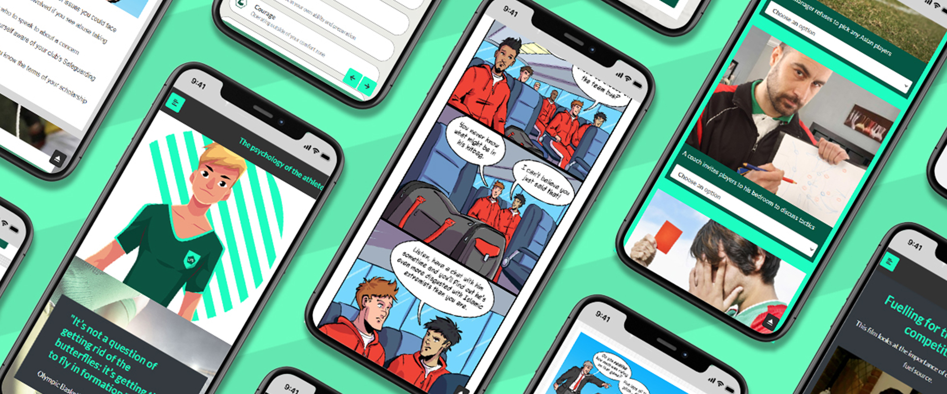
Examples from First Media’s Work
ICS Learn - Flexible Mobile Learning for Professionals
First Media worked with ICS Learn to redesign its PRINCE2® project management training, making professional development more flexible for busy learners.
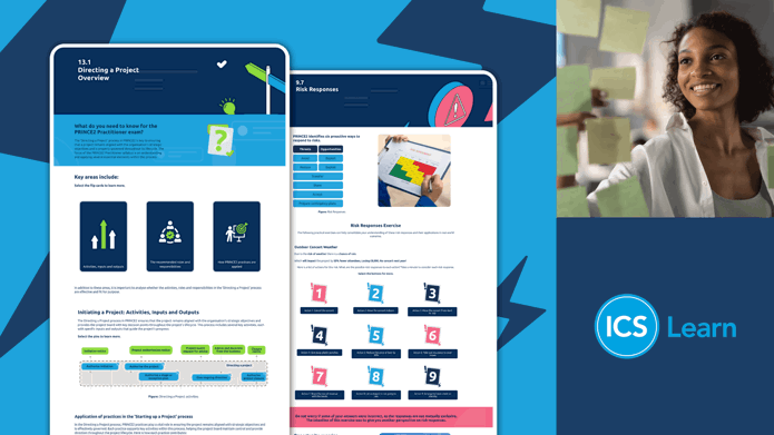
The project delivered 37 short, mobile-friendly modules accessible anytime, on any device. Learners could fit study around their work and personal commitments, turning training into a more accessible and motivating experience.
This project shows how thoughtful design and smart use of mobile technology can make structured learning feel flexible, modern, and engaging.
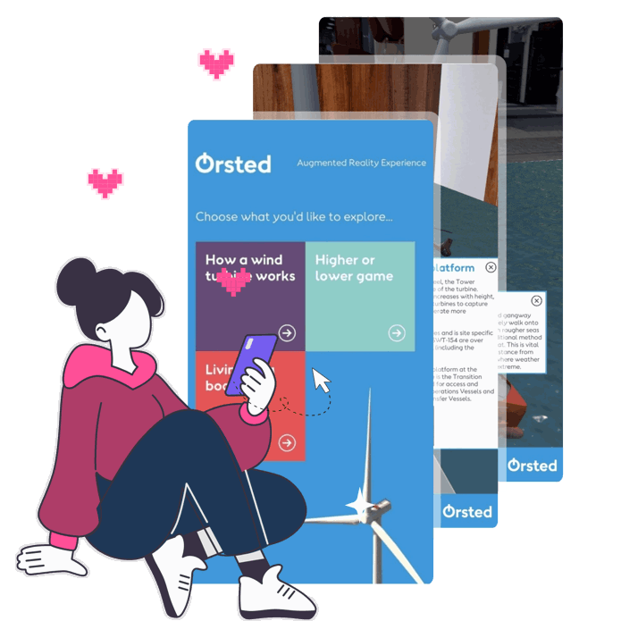
Breast Cancer UK – Accessible Learning Beyond the Classroom
For Breast Cancer UK, First Media developed the Prevention Hub, an online platform designed to educate users about reducing cancer risk through lifestyle changes.
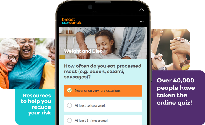
The hub was created with a mobile-first mindset, allowing users to explore interactive quizzes, personalised iGuides, and short articles wherever they are. The result is a resource that fits naturally into people’s lives - helping them learn and take action in an accessible and engaging way.
Vale of Glamorgan - Supporting Change Through Mobile Learning
When the Vale of Glamorgan Council needed to support staff in adopting new ways of working, mobile learning played a key role.
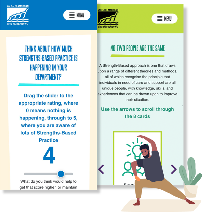
First Media’s digital learning for adult social care ensured training materials were easy to access on phones and tablets, allowing staff to revisit content whenever they needed it. This flexibility supported smoother transitions and helped embed new processes effectively.
Building a Mobile-First Learning Strategy
To make mobile learning successful, it needs to form part of a wider L&D strategy. Here are some steps to get started:
- Identify your audience: Understand who your learners are, what devices they use, and when they are most likely to engage.
- Define learning objectives: Focus on outcomes that can be achieved through short, practical content.
- Select the right platform: Choose an LMS or learning platform that delivers a smooth experience on all devices.
- Create modular content: Break long courses into smaller, independent lessons that learners can complete in any order.
- Promote continuous learning: Encourage employees to access content regularly, not just during scheduled sessions.
- Monitor and adapt: Use learner data to refine your approach and keep content relevant over time.
How First Media Can Help
First Media specialises in creating digital learning experiences that look and work beautifully on any device. Our expertise in user experience design, responsive development, and creative storytelling ensures that content feels engaging and effortless to use.
We help organisations:
- Develop mobile-first learning strategies
- Design responsive, modular eLearning content
- Integrate learning across platforms and devices
- Improve engagement and performance through great design
Whether you want to modernise existing courses or create new mobile-friendly content from scratch, we can help make your learning more accessible, inclusive, and effective.
In Summary
Mobile-first learning has become essential for modern organisations. It gives people the freedom to learn wherever they are and helps L&D teams deliver training that truly fits the way we live and work today.
By focusing on accessibility, usability, and engagement, mobile-first learning turns every moment into an opportunity to learn and grow - helping organisations build a more agile, connected, and future-ready workforce.


Why choose First Media?
Improve your overall performance
Get high-quality creative, eLearning faster and stand out from the competition.
Become more agile and responsive
We deliver engaging, high-quality training and support wherever you are and whenever you need it.
Elevate your team
Our in-house team of designers will work with you every step of the way to ensure you get the right look.
Captivate your audience
We combine novel ways to appeal to our learners natural curiosity and engagement.
Make your ideas come to life with First Media.